← Tasks
Explore alternative design for Home page rows
Problem: The design of item rows on the Home page has a few issues:
- they can be a bit cluttered/confusing
- there are multiple colours close together making it hard to parse the info
- they take up a lot of vertical space
- they don’t show important info like when the update was posted
- read items can be hard to read on windows/firefox
Looks at design improvements to address the above issues.
Inspiration
Discourse:
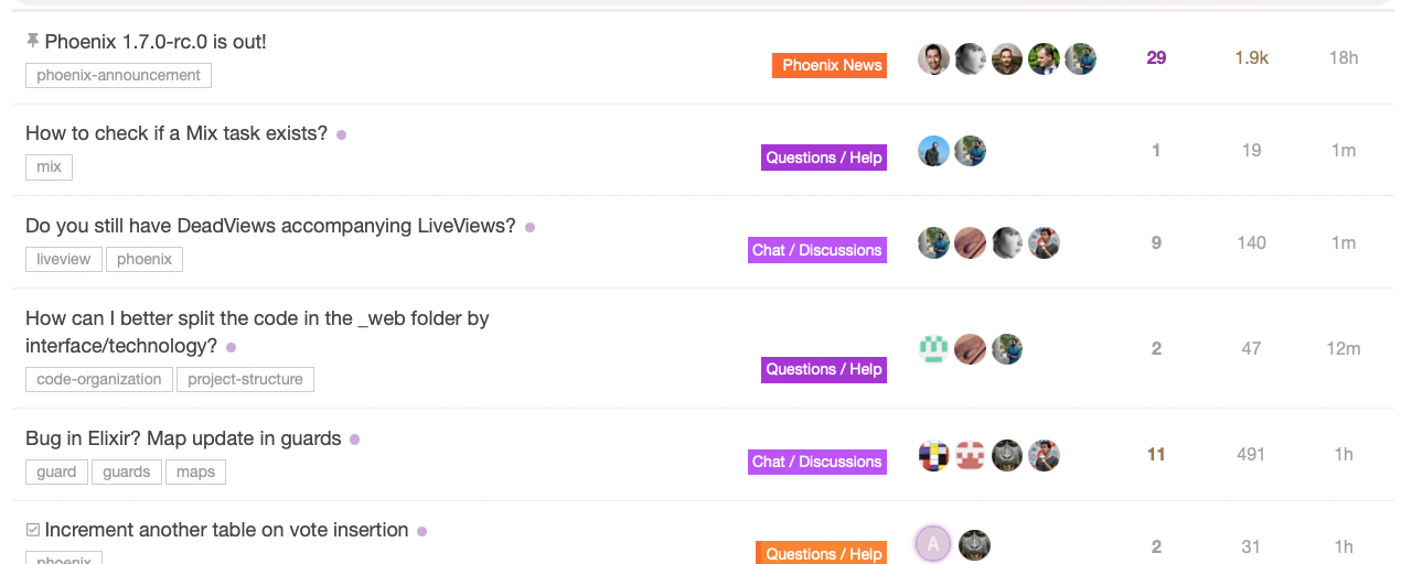
Like:
- spacing
- subtle unread
- clear subforum labels
Dislike:
- too many avatars?
- unread styling too subtle?
- Meaning of right columns not clear?
- Tags vs subforum labels are confusing?
- Not very space efficient
Twist:
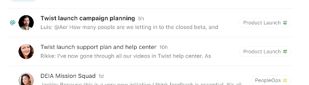
Like:
- minimal / clean
- @ label is great
- unread/read styling is very clear
- shows content snippet
Dislike:
- Doesn’t show number of comments (does this matter?)
Threads.com
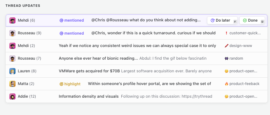
Like:
- mentions label
- clean but also space efficient
Dislike:
- not obvious when the comment was posted
- more channel like rather than threads - what’s the discussion about?
- noisy?
- what does the number next to the name mean?
UX
Must have info (in priority order)
- title
- read status
- project name + icon
- last updated timestamp
- author
Other requirements:
- single row (we can have many items so needs to be more space efficient)
- some hover effect
- some colour/visual interest
Steps
-
Pattern: update_row -
Pattern: thread_row -
Pattern: task_row - ~~Pattern: project_row ~~
-
Pattern: workspace_row - Frontend: Use update_row
- Frontend: Use thread_row
-
Frontend: Use task_row -
Frontend: Use project_row -
Frontend: Use workspace_row

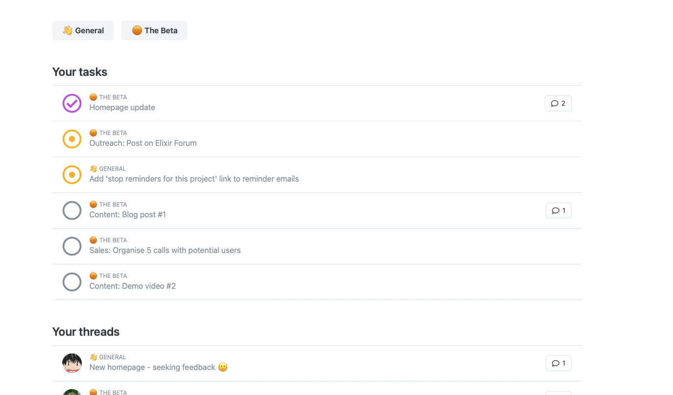
First pass for new thread row design:
Things I like:
Things I don’t like:
Alternative with less contrast but easier readability for read items:
Final thought: Is the comment count important?
It’s nice to have, and shows where a more in-depth discussion has occurred, but it can also introduce bias. I.e. you only look where people are already discussing.
Here’s an alternative with more emphasis on number of comments, whilst preserving the posted at info:
Decided to go with this design for now
We should be able to reuse this layout/design for:
In both the workspace and project views (in project view, the project name/emoji will be omitted). And it works well for unsigned-in users as they simply see the read styling.
We can implement this as two patterns (task_row, item_row)- which share the same class names. 🎉
Final point! Can we use this design style for the project list in workspace/projects too? And the workspace list in /home?