Improved navigation
Problem
A few users have given feedback that the navigation ‘is confusing’. They can’t articulate why, but I’ve heard this feedback consistently enough that it needs addressing.
I believe there are two possible causes of confusion:
- There is no persistent workspace nav
- Users don’t understand the difference/relationship between a Workspace and a Project
To expand on 1), the Workspace nav is currently only shown on Workspace-level pages and is positioned differently to the Project nav. This was to a) keep pages minimal and b) visually differentiate between Workspace and Project pages.
Constraints
Any solution should be quick to implement (1-2 days max) as most of our time at the moment is going on user acquisition.
From a technical standpoint, we don’t want navs which require a lot of data-fetching or that are dynamic. E.g. Showing all workspace projects in the nav. This constraint is to keep things simple and because we are a (mainly) static site, so dynamic page content is complex/slow to implement and maintain.
Possible solutions
Add persistent workspace nav: This should give more confidence to users when navigating between workspaces and projects. It will also make navigating in and out of projects easier.
Reflect workspace/project hierarchy in the UX/navigation: Using nested navbars could help show that projects are within the workspace. This is a common approach on Slack/Monday/Asana etc.
With the correct nav UX, we can incorporate both solution ideas above. The basic idea is having 2 nav bars, a (permanent) workspace-level one, and a (temporary) project-level one, only shown when in the project. This should reinforce the idea that projects are within a workspace.
The downsides of this approach are that more nav is visible on the page (due to permanent workspace nav). Products normally solve this by using collapsable navbars, with some cost to clarity/UX.
I’ve played with several ideas to solve the above and have settled on the following for now:
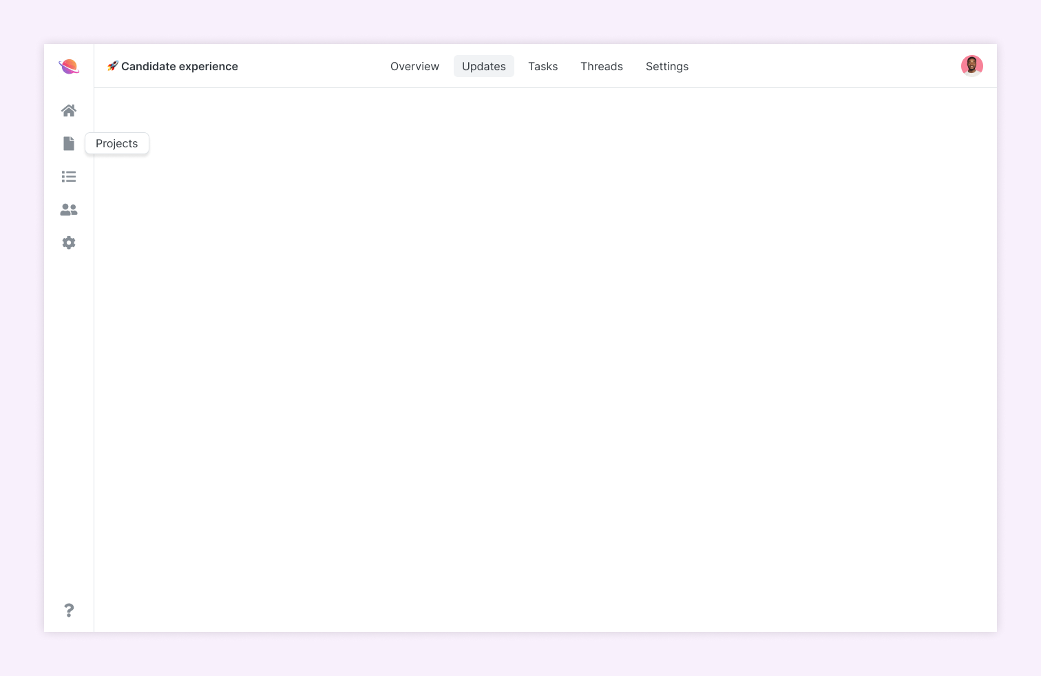
The main downside is the blind nav on the left (partially mitigated by tooltips), however given the small number of options, I think this approach is acceptable for Macro.
NB. We’ve also given more prominence to the help / support link (?) which was previously hidden in a dropdown.
What about mobile?
The new (left) Workspace nav will simply be hidden on mobile, leaving the current experience unchanged. This is simple and will work for now, however we’ll likely have to revisit mobile nav in future.
Todos
-
Pattern - new icons -
Pattern - sidebar button -
Pattern - sidebar account menu -
Pattern - account sidebar -
Pattern - workspace sidebar -
Pattern - updated project nav -
Update /home page layout -
Update /account pages layout -
Update workspace pages layouts (+ content) -
Update project page layout -
Pattern - account header (mobile) -
Pattern - workspace header (mobile) -
Pattern - project header (mobile) -
Update account/workspace/project layouts with mobile headers
